Using complementary colors is the best way to make your photographs look outstanding. It helps to do creative adjustments to your image, including color balance, split toning, white balance, temperature, and tint. In addition, you can also give a natural contrast with complementary colors in your photographs that make your image look attractive and intriguing.
This way, you can take your photographs to the next level that catches viewers' eye faster than others. You might now wonder how to use complementary colors. For your convenience, we will let you know using the procedure of complementary colors with Adobe Photoshop in this context. So, don’t go anywhere; stay with us reading this article.
What Are Complementary Colors?
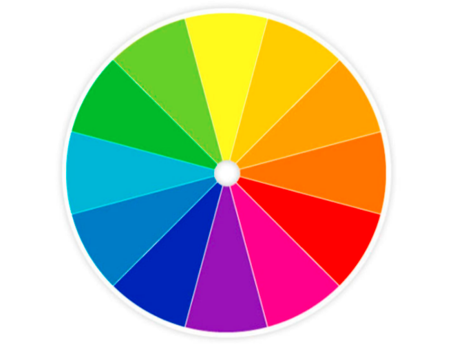
Complementary colors exist opposite one another on the color wheel. Typically, the color wheel is a diagram displaying twelve colors relative to each other on a color scale. When the two colors are mixed in the proper proportion, they form a neutral color (gray, white, or black). For example, common colors: red and cyan, yellow and blue, and magenta and green are complementary pairs.
However, the colors don’t need to be exactly the opposite. The complementary color effect works effectively if two colors are usually opposite. For instance, red and blue make a wonderful complementary colors effect even though they are not exactly contrasting colors. Now you may think about using complementary colors for color correction of images.
Typically, several apps you will find on the internet can be used to use complementary colors for color correction. Additionally, you can make color corrections to your image by using an online color editing service. For your convenience, we will show using complementary colors through Adobe Lightroom in this context.
How Do Complementary Colors Work?
Exactly opposite colors on the color wheel make up complementary colors. This means that the two colors mixed together form an achromatic (white, gray, or black) light mixture. For that, you can draw a shade of yellow with a tinge of orange/green. But it will not be possible to describe reddish-green or purple with a hint of yellow.
According to color theory, the more differences there are between two colors, the more contrast they will create. Complementary colors provide the strongest contrast by creating an energizing and vivid effect. This effect contains the maximum saturation. The good thing is that complementary colors create contrast naturally so that you don’t have to create in post-production. As a result, your photographs will catch the viewer’s attention easily.
Understanding Complementary Colors on the Color Wheel
You will find twelve colors in a circle with a diagonal line on the color wheel. Red, yellow, and blue are its three primary colors. You will get a new secondary color when you blend two main colors. For instance, if you blend blue and red together, you will find a purple color. The most common complementary colors are pointed out below:
- Blue and orange are complementary colors.
- Red and green are complementary colors.
- Purple and yellow are complementary colors.
How to Use Complementary Colors for Color Correction of Your Images?
You will find several applications that can be used in complementary colors for color correction of your photographs. Below we have described the procedure of using complementary colors for color correction to your images through Adobe Lightroom.
Create a Color Palette
Before you start color correction in your photo, you need to be clear about what colors you want to add to your photo. Creating a simple color palette will be a good way to refer to while editing your images. The color palette can be a collection of images or a mixture of different colors. Add your desired photo to Lightroom and set your mind that you are going to add something special.
Align With Hue
Start with the Hue section from the HSL tab. This Hue Slider enables you to replace existing colors with closer colors on the color wheel. For example, to change all red tones in your image to magenta, you can adjust the Red Hue slider to -100. All reds will be replaced with oranges by moving the slider to +100. You can also adjust aqua tones to replace all aqua/green colors with blue. In addition, changing the Blue slider to deepen blue tones and removing the left aqua/green color cast is also possible.
Subtract with Saturation
With Saturation Sliders on the HSL tab, you can control the intensity of your image color. When you increase the saturation, the color of your image will be more vibrant and stronger. Your image color will be less intense when you decrease the saturation. To work with the specific color, increase or decrease red, orange, aqua, and blue colors separately. You will see the live change in your image with every color change.
Lighten with Luminance
The Luminance slider will assist you in adjusting how dark and bright your image will be. You can add brightness to your image when you increase the slide. On the other hand, lowering the luminance slide will make your image look darker. You can also alter certain colors like orange, yellow and blue values until you are satisfied with the brightness of your image.
Adding Character With Curves
In the tone curve option, you will find a histogram with a linear line running from bottom left to top right. The left portion of the histogram represents shadow, and the right portion represents the highlight of your picture. On the other hand, the middle part of this histogram represents the mid-tone of your picture. By tapping on the point curve icon, you can create control points on the graph. These control points can be dragged up or down to change the value of corresponding tones. You can work with four different color channels RGB, Red, Green, and Blue with this.
Color Styling
Every pixel in an image is made up of red, green, and blue colors. When you change the tone curve, these individual color channels impact all pixels. This way, your image will be present in shadows, mid-tones, and highlights. You can also add a subtle warm or cool tone to your image look by changing the colors. To cool your image shadow, adjust the tone curve channel to blue. Using this method, you will be able to add more blue color to dark areas of your photograph. You can also apply different colors using the same process.
Split Toning (Option)
It is the final process in the complementary colors for color correction. If you think your image is already perfect, you can ignore this tool. You can add a subtle split toning to your image with this tool. This tool allows you to add a specific tone to your shadows and highlights. You can also back the hue and saturation sliders to highlights and shadows. For example, changing the warm colors to complement 45 for highlights and 240 for shadows would perfectly align with the color palette.
Summarization
After doing all the above customization, take a few minutes to check your edited image color and style overview. For a good overview of your edited image, follow the steps pointed out below.
- Check the complementary color palette and align the existing colors in your image. Remove those colors that aren't quite suitable for your image.
- To correct the colors of your images, increase the saturation and luminance of the HSL panel.
- Remove atmospheric shadows and subtle underlying tones from your image using the tone curve.
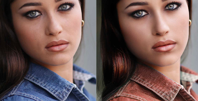
- View the unedited and edited image at a time, check what you have changed. If you think you will need some more adjustments, make the color change on the HSL panel.
Conclusion
Sometimes your captured photos may not be good as you want, or a photo may need some color adjustment. In that case, using complementary colors will be a good way to correct colors in your image. With this method, you can make your image look warm or cool and add contrast energy to the photo.
However, using complementary colors could be challenging for some people. That’s why, in this context, we have covered a complete guideline about using complementary colors for color correction of images. Following the process discussed above, you can easily make your image look vibrant and colorful.






1 Comments
10 Best Movies and TV Shows By Asian-Americans - Video
ReplyDeleteTop 10 Asian-American Movies and TV septcasino Shows by Asian-Americans. by VideoGameArt. 10 Best Movies and งานออนไลน์ TV Shows by Asian-Americans. by youtube downloader Videoslounge.